User Empathy
Understanding who people are and how they interact with our software is critical to creating products that truly solve users’ problems and bring joy to their day-to-day lives.

Product Engineer Series
{PRODUCT-ENGINEER-TOC}
To be an effective product engineer, the first focus should be on our users—the people who are using our products. Understanding our users and knowing their needs, desires, and pain points is so critical for a successful product.
Historically, “user empathy” wasn’t a typical conversation topic among engineers. However, modern software sets a much higher bar for user experience than was common before the 1980s or 1990s—largely due to user-centric companies like IDEO, Apple, Google, and others. User expectations for great experiences have never been higher. If your product doesn’t meet or exceed these expectations, users are far less likely to choose your product over competing ones.

For clarification, we do have a Product Designer role on the team to champion this area, so you don’t have to bring all the user empathy on your own. But having even a basic understanding of human behavior and caring about user needs makes product discovery and delivery smoother, because the entire team is aligned on what matters and why it matters.
When engineers fully empathize with users and strive for a great experience, they often create truly innovative solutions. A famous example is the original iPhone’s virtual keyboard. As described in Creative Selection, Apple engineer Ken Kocienda didn’t rely on a fixed specification or final design. Instead, he created multiple prototypes and ended up inventing an innovative solution for virtual keyboard using the dictionary data to predict the word. When it was released, the keyboard received widespread acclaim. I was working at a company that made Windows Phones at the time, and I remember being blown away by it.
— Ken Kocienda (@kocienda) February 28, 2021
Product Is for Humans
Let's take a moment to think about why we’re writing software in the first place. Everyone might have a different “why.” It could be for financial reasons, or to achieve personal success. But many people share a common goal: to serve human beings or to positively affect the people who use our software. If you share this goal, welcome aboard.
Humans are precious yet imperfect. They have intentions and feelings. They seek safety and security, yet sometimes they feel lost and overwhelmed. They have goals they want to accomplish, both personally and professionally.
Understanding who people are and how they interact with our software is critical to creating products that truly solve users’ problems and bring joy to their day-to-day lives.
Good Products Solve User Problems
Think of your favorite app. Why do you like it? It might have a cute icon or run super fast, but most likely, it solves a real problem for you. For example, I use Obsidian to plan my small group gatherings and make my grocery pickup quick and easy. I use my Camera app to capture precious family moments. These apps stay on my home screen because they address real needs.
To solve user problems effectively, you have to understand what those problems are. That requires understanding your users: Who are they? In what context do they use your product? What do they want? What do they need? What are their pain points?
In Inspired, Marty Cagan says that it’s all about solving problems, not implementing features. And in Continuous Discovery Habits, Teresa Torres emphasizes the importance of continuously engaging with users to gather insights and validate ideas. There are many ways or levels of doing it, but I recommend a few very practical ways to better understand our users.
- Reviews and Support Tickets: One of the most low-hanging fruits is to read user feedback—whether it’s app reviews on the app stores or support emails you’ve received. By reading their compliments, frustrations, and everything in between, you’ll be surprised by how much insight you can gain in a short period of time.
- User Interview: The product team can meet the user and hear who they are, how they use the product, and receive feedback or questions. There is so much valuable information you can capture by talking to a person directly. But more than anything, I personally found it reminds you there are actual people behind the product you’re working on, and it helps you build user empathy when you can remember their names, faces, and stories.
- Data: These days, there are so many good tools that let us learn user data—Google Analytics, Amplitude, Segment, etc. Knowing high-level data about users is another good way to understand them: their demographics (age, location, language), when they use the product most, how often they use it, and which feature they use the most based on time spent, etc.
Good Products Are Easy to Use
In The Design of Everyday Things, Don Norman introduces the concept of the “Norman door”—those doors that leave you confused about whether to push, pull, or slide. Their design fails to communicate how you should interact with them.

"Two of the most important characteristics of good design are discoverability and understanding. Discoverability: Is it possible to even figure out what actions are possible and where and how to perform them? Understanding: What does it all mean? How is the product supposed to be used? What do all the different controls and settings mean?"
—Don Norman, The Design of Everyday Things
A good product should be so intuitive that people “don’t have to think too much”—a nod to Steve Krug’s principle in Don’t Make Me Think. Difficult-to-use products don’t just impede users from reaching their goals; they also invite user errors. Worse, people often blame themselves for these mistakes, rather than the design.
Online banking systems in South Korea are notorious for their clunkiness. Interestingly, this was partly due to their innovative approach—they had to create their own solution for transferring payments online before secure internet protocols existed. They ended up using ActiveX—a plugin for Internet Explorer—and additional software to manage certificates and authentication. The problem is that it involves many steps, frequent installation issues, and countless ways to fail. As a software engineer, it could take me half an hour to an hour just to renew a certificate and complete a transaction. For some people—like my parents—it’s almost impossible to get through the process. Yet my parents never blamed the system; they blamed themselves, saying they didn’t know much about computers. It broke my heart. They shouldn't have had to know how to install ActiveX if the product team had designed the system with everyone in mind. That memory still drives me to create software that’s easy to use, regardless of their familiarity with technology.
The Human Interface Design Principles
Thanks to growing awareness of good user experience, we have a wealth of resources to learn from, including the one from Apple.

When Apple released the first Mac, it popularized the desktop metaphor—windows, icons, and menus—built on Douglas Engelbart’s pioneering work and research from Xerox PARC. The accompanying Macintosh Human Interface Guidelines introduced foundational principles, which redefined how people expected to interact with software. Competitors soon adopted similar conventions, and these guidelines became the industry standard.
The following design principles are mentioned in the book. (Over time, Apple has significantly revised this document—especially when launching new platforms like the iPhone or Apple Vision Pro. Today’s version no longer includes the Design Principles chapter, which I think is a loss. You can check the 1992 version here.)
1. Metaphors
Use metaphors involving concrete, familiar ideas and make the metaphors plain, so that users have a set of expectation to apply to computer environments.
There is so much data in this world, and our brain uses metaphors to understand it with relatively small memory. When your product uses a familiar metaphor that users already know, it becomes easier to use. For example, a “folder” in software is similar to a real-life folder—it can hold multiple files. Of course, there are differences—software folders aren’t as limited in capacity. But using the term “folder,” which is already familiar to the user, reduces the learning curve and lets them start using it right away without consulting a manual.
2. Direct Manipulation
Direct manipulation allows people to feel that they are directly controlling the objects represented by the software.
Imagine a map app with two interfaces. One has plus/minus buttons to zoom in and out and arrow buttons to pan left, right, up, and down. The other lets you pinch to zoom and drag the map with your fingers. The second interface is more intuitive because it mirrors real-life gestures; you’re directly manipulating the “object” (the map). This approach also offers immediate feedback and a sense of control.
When you consider direct manipulation, mapping the interface is crucial. Mapping refers to the intuitive relationship between a control’s layout or positioning and its function, making it easier for users to understand how their actions will affect the interface.

I recently had the chance to test-drive a Tesla Model 3. I loved many things about it, but there were a few aspects I didn’t. One of them was the turn signal control. When I went to signal a right turn, I reached for the usual stalk, but it wasn’t there. Instead, I found two arrow buttons on the steering wheel: a right arrow and a left arrow. Pressing one of the buttons activated the turn signal indicated by the direction. The problem was that the “right” arrow button was placed on the top. Over the next 30 minutes, I lost count of how many times I had to figure out which button was which. It would’ve been much nicer if the right turn button was on the right side. The good news is that Tesla updated the layout, and now that’s exactly how it works.
3. Consistency
Consistency in the interface allows people to transfer their knowledge and skills from one application to any other.
A consistent product reduces the learning curve. For example, if you have used a checkbox before, you don’t have to learn it again. The moment you see a checkbox, you expect to tap or click it to change the state—and seeing a checkmark means it’s selected. You also know you can tap it again to uncheck it.

Consistency matters within your product. It also matters across your previous, current, and future versions. Additionally, it matters between your product and others in the same ecosystem.
Snapchat has a poor reputation for its navigation system because sometimes you don’t know how to go back. Taken on its own, the app has nice visuals and is fun to use. The problem is that most people are already familiar with standard app navigation, and Snapchat’s navigation model is not consistent with it.
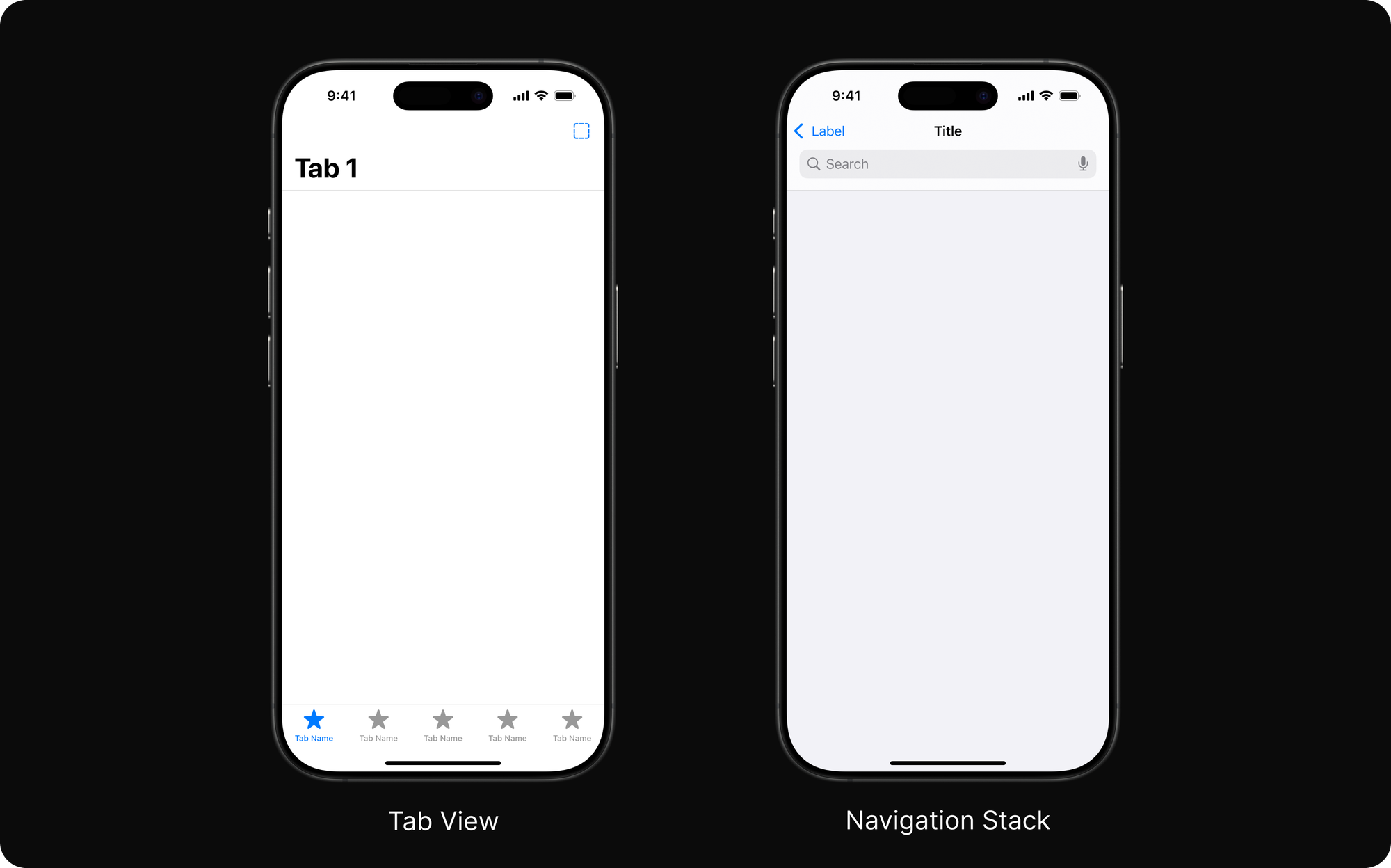
Tab views and navigation stacks are good examples of widely adopted app navigation models. When you see a tab view, you immediately know what the high-level menus (tabs) are and which one is active. When you use a navigation stack, you know how to go back because there’s a “Back” button in the expected spot, or you can use the edge-swipe gesture if the app follows the standard pattern.
4. User Control
Allow the user, not the computer, to initiate and control actions.
Everyone dislikes pop-up ads. They’re the worst. There are even memes about them. They’re bad because they open a new window without your initiation, preventing you from doing what you intended.

A good product knows when to do something automatically and when to wait for user input. What if a camera app automatically uploaded your photos to a public location without your consent? That would be a catastrophic mistake on the part of the product team. At the same time, we do expect our camera apps to apply basic computational photography automatically—such as fixing white balance or reducing noise—so we don’t have to do it manually every time.
5. Feedback
Keep users informed about what's happening with your product. Provide feedback as they do tasks and make that feedback as immediate as possible.
Once upon a time, there was a game called Diablo 2. It was hugely popular, but the network infrastructure and reliability weren’t close to today’s standards. As a result, tons of users would end up waiting at the loading screen, which was frustrating.

The loading screen was visually interesting—a main character, Deckard Cain, stood outside a door waiting for it to open. The problem was that the graphic did not move at all during long waits that could last up to half an hour, leaving you with no clue whether you were still in the queue or if the network request had timed out. The screen lacked feedback indicating that you were still waiting in line.
When done well, feedback gives you a sense of safety and control. On the other hand, a lack of feedback—or vague, unhelpful feedback—causes frustration and erodes trust. For example, an error message saying only “Something went wrong.” gives you no idea why it happened or how to fix it.
6. Forgiveness
Forgiveness means that actions on the computer are generally reversible.
This applies to both destructive and non-destructive actions.
For destructive actions, you might add an extra confirmation dialog. Let’s use the Photos app as an example. When you delete a photo, it asks if you really want to delete it. Even after deletion, you can still go to the “trash” and restore it until it’s permanently removed after 30 days.
For non-destructive actions, forgiveness is also useful. Say you try to tap an item on the screen but accidentally tap the one next to it. You can hit the Back button and try again. You’d expect the original item you wanted to tap to still be there, ready for you to select.
Conclusion
Effective product engineering starts with a deep empathy for the user, ensuring that every decision is informed by an understanding of their needs, desires, and pain points. By collaborating closely with product designers and applying time-tested design principles, product teams can build innovative, intuitive products that not only solve real problems but also delight users.
Further Reading
If you’re developing mobile applications, I highly recommend that you check out these guidelines.
Apple's WWDC17 session, Essential Design Principles, is an outstanding talk that covers design principles through real-life examples.
Here is additional reading list if you're interested in this topic:
- The Design of Everyday Things by Don Norman
Introduces key design concepts such as discoverability, feedback, and how good design should reduce user error and confusion. - Don't Make Me Think: A Common Sense Approach to Web Usability by Steve Krug
A classic on web and interface usability, emphasizing intuitive navigation and ease of use to minimize user frustration. - Creative Selection by Ken Kocienda
A first-hand account of how Apple engineers and designers iterated to create groundbreaking products (including the iPhone’s virtual keyboard). - Inspired: How to Create Tech Products Customers Love by Marty Cagan
Focuses on product management and how to solve real user problems, rather than simply building features. - Continuous Discovery Habits: Discover Products that Create Customer Value and Business Value by Teresa Torres
Offers a practical framework for continually engaging with users to gather insights, test ideas, and make informed product decisions.
Disclaimer: This post contains affiliate links. This means I may earn a commission should you chose to sign up for a program or make a purchase using my link.